Here is my first draft of my driftwear logo.

with the font I made.

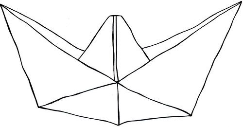
Here is the second draft, which I straightened out a bit.


third draft


What do you think?
Like? Hate?
Think the lines are too curvy? lines too thin?
Let me know! I'd love your feedback. :)Think the lines are too curvy? lines too thin?


4 comments:
more boat like maybe?
I left you feedback on flickr but I'm going to post here too- I love the top one where the curvy lines simulate hand drawn much more than the straight lines...I'm thinking a bit of a tilt on the boat would add to its whimsy which I see as part of your brand- than to follow up on Coop's note maybe one tiny additional detail that adds to the boat feel like a little 's.s.drift' or a little lifeboat or something OTHERWISe that top one is my FAVE!!
I like the top one, and I agree with Cooper and Ms. Diaz. Your design is whimsical and visually appealing, but it needs a little more of a nautical touch. Looking forward to hearing more about your progress on Monday!
ok so I like the hand drawn boat with the formal typeface - and so we're clear from what I wrote earlier I meant a life preserver like the little donut floaty...
Post a Comment