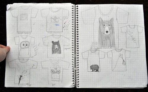
This week I focused on this question:
- What designs are most attractive to my audience?

Today I made my own font. I think this is an important part of branding that I can use with my sticker, etsy, and blog. It looks kind of childish, but I like it. Once i straighten it out, it will be good.

(source: here)
My mentor and I talked about picking models. His advice was to pick role models and trendsetters. I was torn if I should pick models from all the grades or to stick with the older students. I thought that if I picked models from all grades I would be able to network easier and to get more people excited. However, I don;t know if having younger models would prevent older kids from buying. I think I will try to stick with older models.
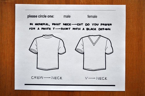
This week I will be working on transferring designs to the computer, doing as survey on neck-lines, ordering stickers for promotion, making a banner for etsy & the blog, making a logo for inside the shirts, e-mailing models, creating an icon for etsy and flickr, and thinking through a brand video. There is much to be done!


1 comment:
So wheres the font?? I want to see! Also as for the rec to have trendsetters and models (love it) I think you should have a mix of younger and older students BUT have them each be targeted just to that age group in out of the box marketing. When you're going to have -one model one target than go with the older.
Again just my opi,
-Retto
Post a Comment